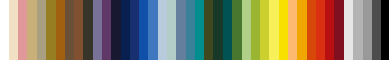
Colors Glyn's 42. The 'Guaranteed Classic' colours which work everywhere
on paper, ink, metal or wood, with gloss, emulsion, matt, watercolour, gouache, powder coat, enamel, screen-print, dye, glazes, food colours or optical displays
I spend a lot of time picking colours. But which colour do you want? Surprisingly, there isn't any definite way of describing colours. You can specify the hue of a colour by reference to wavelength of light, but that's only part of it, you really need to know the saturation and the luminance as well. In any case, what we see on a surface is a complex mix of lots of different colours, so that the only way to specify a colour is still ostensively, as in "look at this, I mean this colour here".
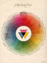
Previous systems (like Moses Harris' original Colour Wheel of 1811, shown here) - have tried to define ALL possible colours from a few first principles. But humans don't choose to use all the colours, instead they repeatedly pick just a few, and finding those few is what Glyn's 42 is about.
The British Standard (BS) colour system is widely used to identify decorating paints, but RAL numbers are used for industrial paint, for powder coat and plastics. Pantone codes are pretty universal for printing, and NCS is used in architecture. Additive codes are used for computer graphics, but hexadecimal numbers for websites. Then there's subtractives for dyestuffs, and all those odd names used by artists.
So here are the 42 colours which turn up more-or-less the same in all those major colour systems, which probably means they're the 42 most popular colours, the 'Perfect Classics'. Pick one, and you can be pretty sure that it is tried and trusted so it'll look great, and that, nomatter what you want, your supplier has it, and the other supplier has it too. So your printing will match your architrave and look the same on your website. Easy!
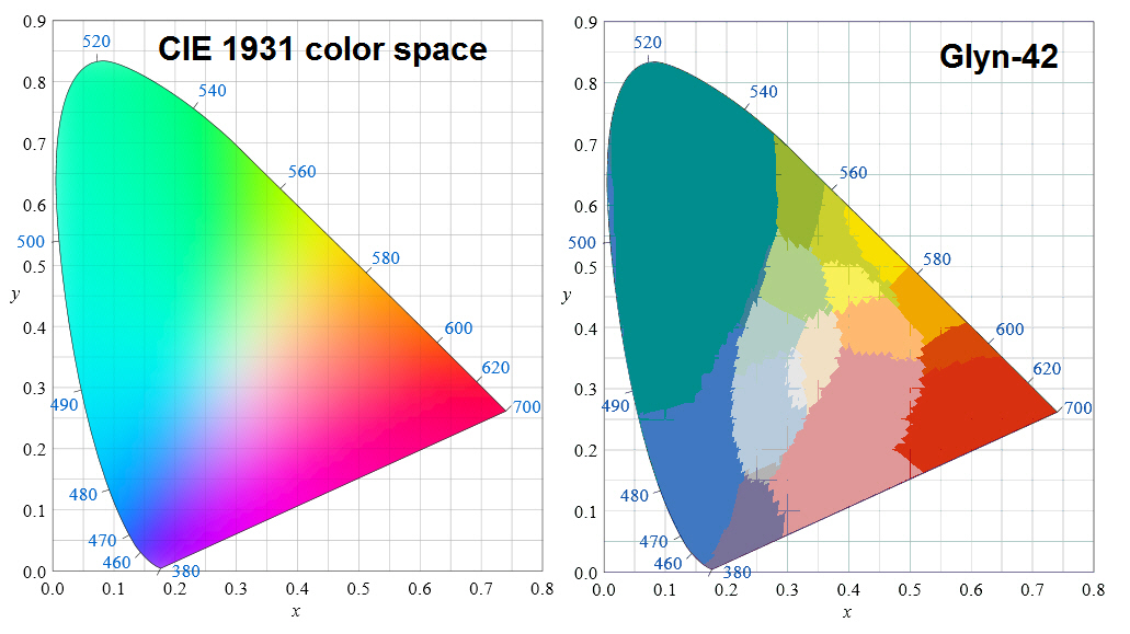
The Glyn-42 Set does not attempt to define all colours, and when compared to a complete colour set, such as the CIE 1931 color space G42 appears to do very badly indeed.
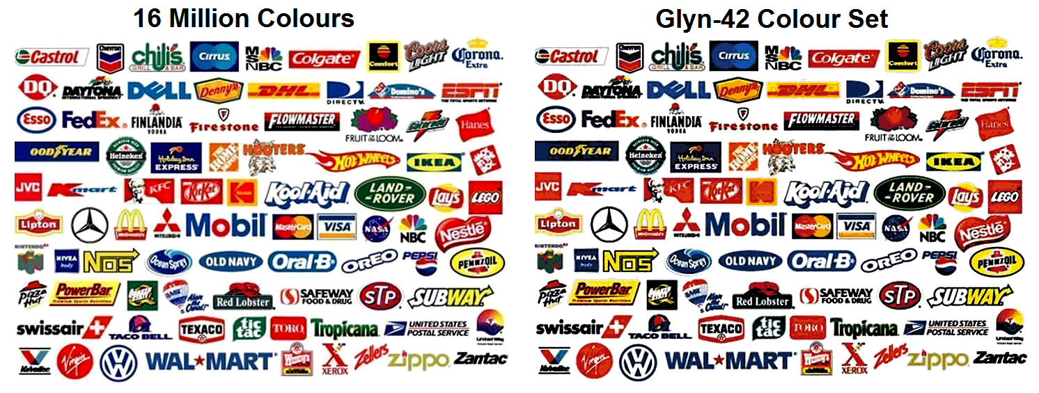
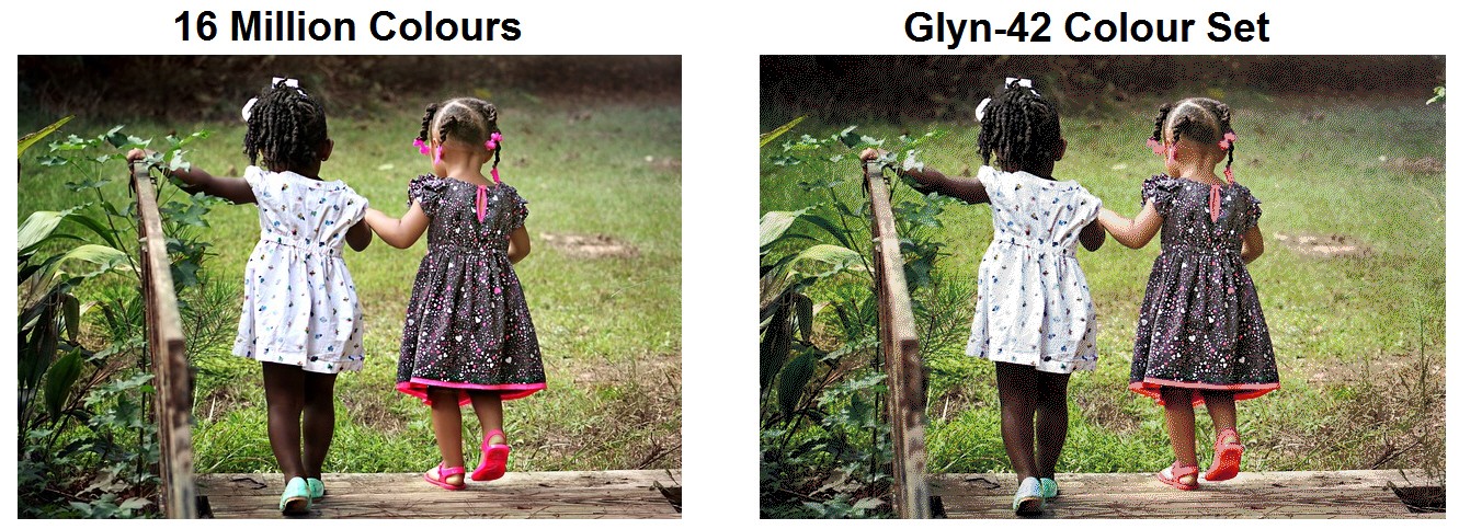
But Glyn-42 is an attempt to express, in condensed form, the colours people actually use, so when we take images and colours chosen by people - here I've picked a random set of corporate logos - the G42 set supplies virtually all of them so that it is difficult to spot any difference at all between it and a 16 million colour version...
Likewise, G42 does extremely well expressing the colours of nature and human skin tones. G42 gives the colours we see and the colours we choose.